I was recently visiting the RISD Museum where they had an exhibit on Text, Paratext, and Images. I noticed some Indian art, particularly from the Mughal period, that stood out to me.
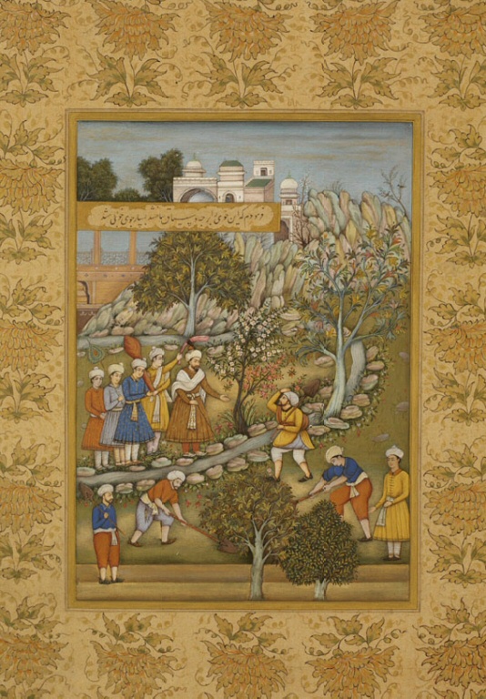
Since then I have been looking at a lot of Mughal Art/Paintings from the period (1500-1700 AD). So I wanted to write out some tendencies that I noticed that I think help define the style for me.
Color and Decoration
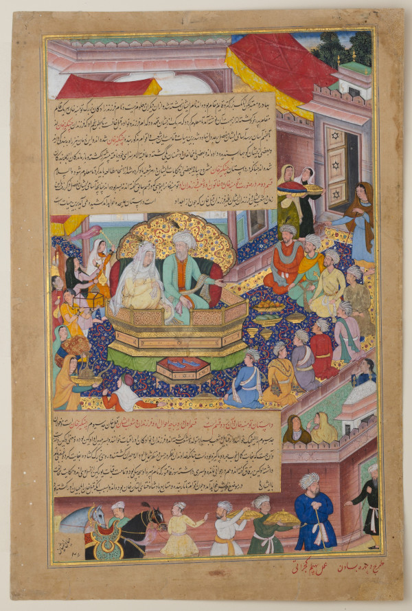
Warm colors are the first thing that stood out to me in Mughal art. Shades of orange, yellow, pink/peach are very common throughout. This primary palette is also used with blue acting as a primary highlight color. I have seen different paintings use different amounts and shades of blue but to me, it always stands out since it contrasts so well with the other warmer colors.
The paintings also come off as more vivid as there are no shadows. There is no play of light and things seem a lot brighter because of it.
In addition to the colors, most paintings I see have intricate designs somewhere. In the painting above, the carpet and the throne/seat have an intricate design. In others, I have seen the clothes of the main characters have it or sometimes the border of the painting itself has some intricate designs.
Perspective
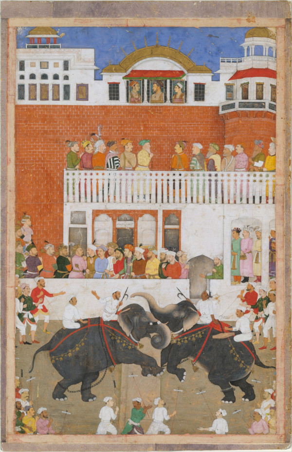
Paintings use perspective to give a sense of depth and establish spatial relationships between objects. A simple result of this is that things that are supposed to be farther away from the viewer are shown as smaller than the things nearer.
In the Mughal style, size is reserved to establish the importance of figures. More important objects/figures are drawn to be bigger. Similarly, the location of figures in the painting is also used to highlight the importance. More important figures are drawn “higher up” in the painting. Both of these are evident in the painting above. The emperor and his sons are drawn at the highest location highlighting their importance. Additionally, all the figures at the higher levels are drawn larger than the figures at the bottom (even though the figures at the bottom should be closer to the viewer).
With these stylistic choices, one would think that the paintings would fail at establishing spatial relationships but the painting above still succeeds at it. Despite the figures on the balcony being larger, it is still clear that they are farther and higher above the ground.
Differences and Later Influence from European Art
Usage of size for importance (as opposed to distance) and usage of flat lighting/colors (instead of light/shadows) are the differences that stand out to me compared to European art from similar periods. However, due to frequent interactions with the European world, many artists experimented with combining the art styles.
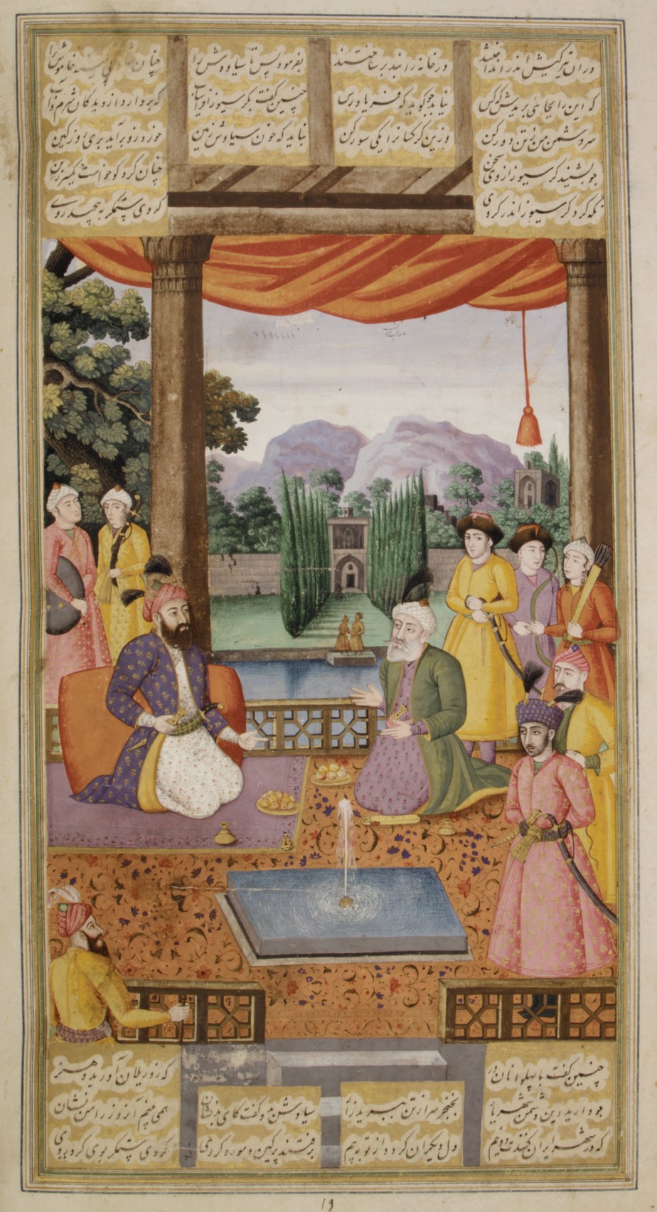
The painting above shows the use of partial perspective. The garden, the building, and the figures by the water are sized to reflect their distance from the foreground. However, the figure on the bottom left should be bigger since the figure is closer to the viewer. However, to keep the emphasis on the seated figures, the artist chose to bypass perspective for that part of the painting.
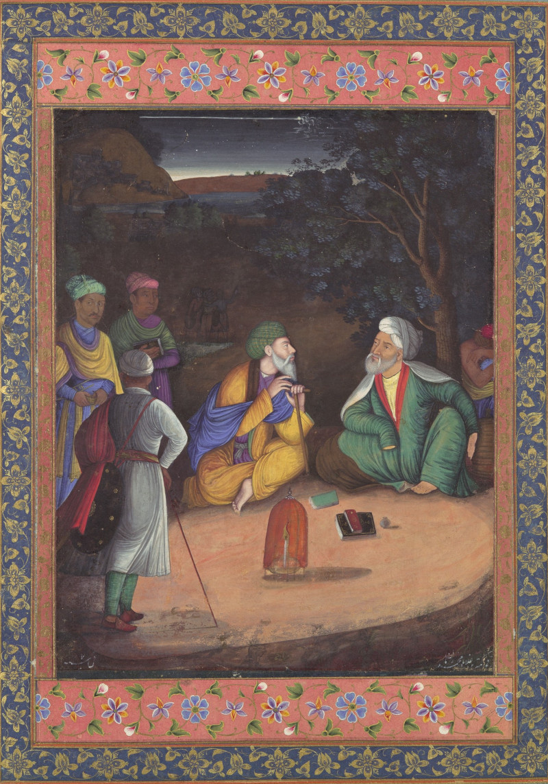
This painting combines the play of light/shadows, common in European paintings, with the color palette common in the Mughal paintings.
After the Mughal Empire
While the Mughal empire lasted till the mid-1800s, the Mughal empire started its decline soon after the end of Aurangzeb’s reign in 1707. With this decline and the larger European presence in India, more European styles started being adopted through the region.
Since India’s independence in 1947, the Indian art scene seems to be varied with many different styles and themes being popular. I even found an artist that specializes in the recreating mughal style art.